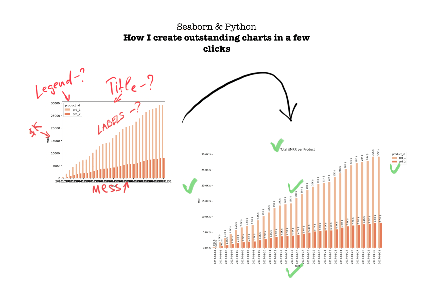
Seaborn - How to make beautiful charts and graphs for Data Analysts
Mar 1, 2024
Sometimes, we do not want to waste time connecting data to BI tools like Looker, Tableau, etc.
Especially when the task will require some sort of automation in the future.
Python + Seaborn are the saviors of Data or Product Analyst's precious time.
Recently I found out that my folder with generated charts using Seaborn surpassed 1000 images.
That's why I decided to share my go-to code to generate beautiful and visually appealing charts using Seaborn.
For showcasing purposes, I will use this SaaS dataset with user subscriptions for calculating MRR, Retention -> Kaggle Link.
Seaborn - Bar Charts
Lovely Bar Charts.
Everyone knows them, and everyone uses them for different aims.
I will not dig into the Data Visualization bible to discuss when you should use a Bar Chart.
Here is the default Bar Chart in Seaborn:
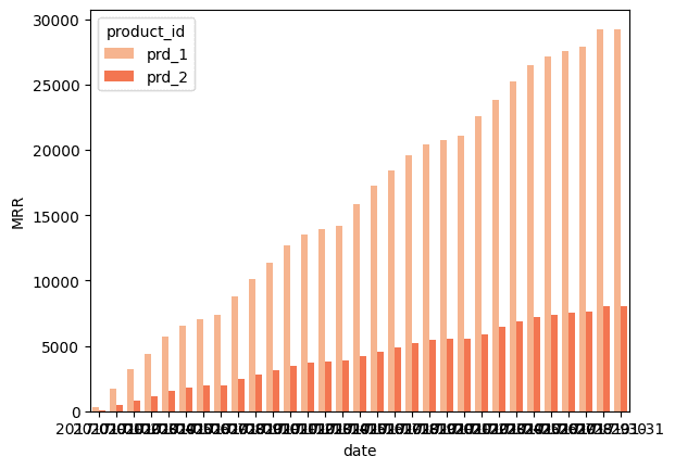
No doubt it is not a Tableau or Looker level.
However, Seaborn is built upon Matplotlib. Thus, it is easily customizable, which means we can do whatever we want here.
Here is the mine Upgraded version
It took 11-minutes to stylize it and make reusable.
What I've changed:
Formatted of X and Y axis lables
Moved legend outside
Added Title
Added formatted Value Labels on top of each bar
Removed border
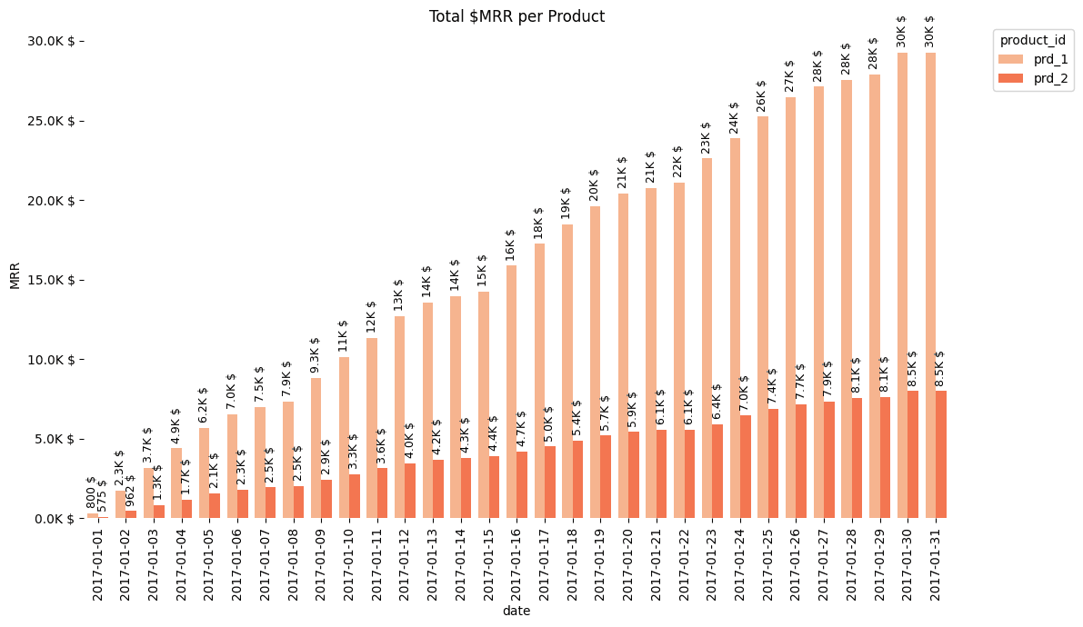
Still not the ideal one, but it is definitely better.
What can be improved: Added Stacking option (currently can be done via joining to 2 separate charts), auto-formatting to the Y-label, render only each N date for X axis.
Let's take a look at the code of Upgraded Seaborn Barplot:
Pretty simple set of instructions. Nothing fancy.
However, the most interesting part is showing the formatted value labels.
Here is the code to properly render formatted value labels:
That's all for Bar Charts.
Seaborn - Heatmap Charts
Whenever I need to check cohort statistics like Retention, LTV, Churn, etc -> Heatmap chart is a nice choice to get a clue about each cohort's progress.
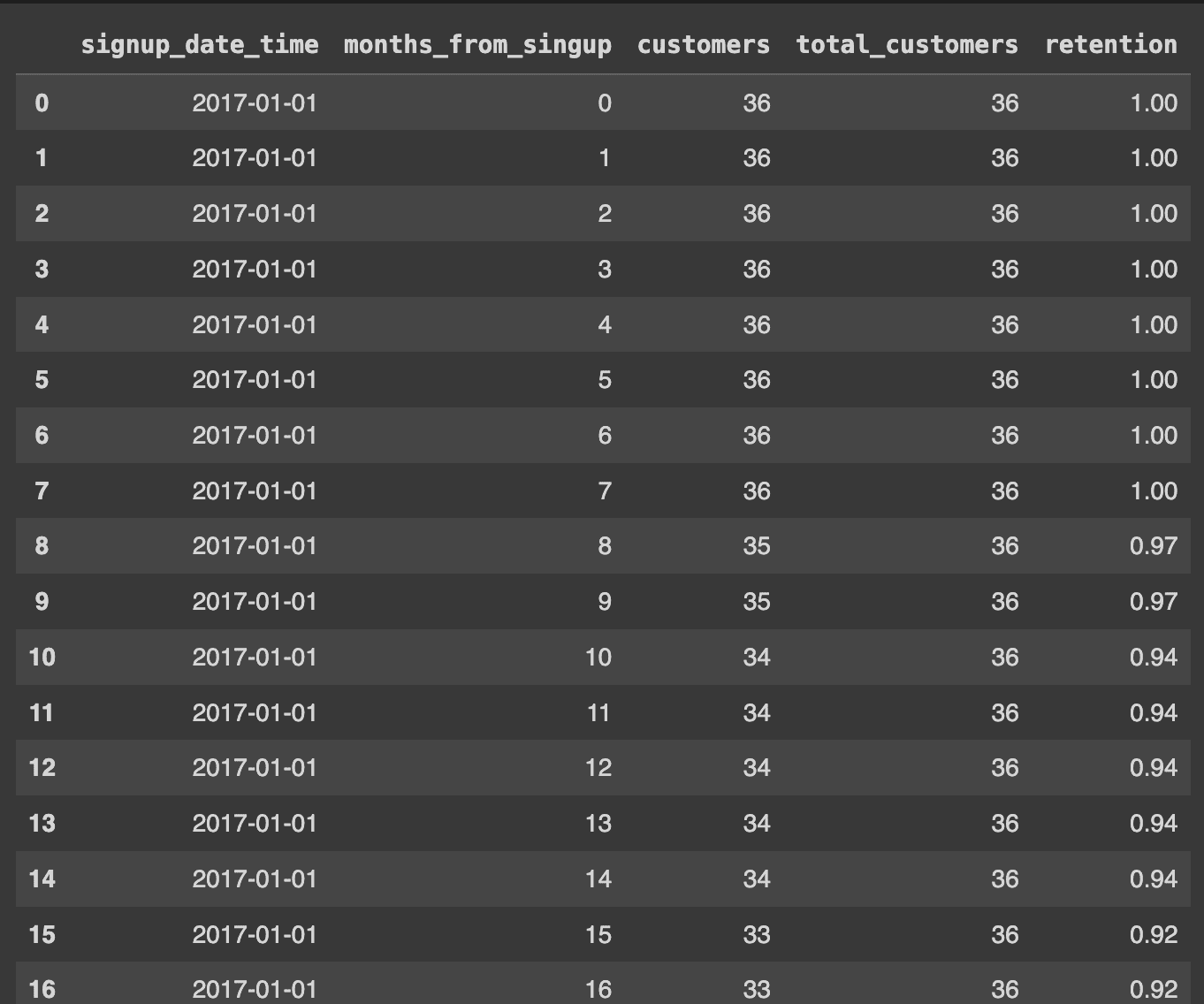
Before we start, let's take a look at the data. I will use a Dataframe with Retention data for each subscription.
Initial look:
signup_date_time - certain month cohort
months_from_signup - months from the signup_date_time passed
customers - how many unique customers are still active in the months_from_signup in the cohort of signup_date_time month
total_customers - overall quantity of unique customers that got into this cohort
retention - how many of total_customers survived till months_from_signup from this cohort
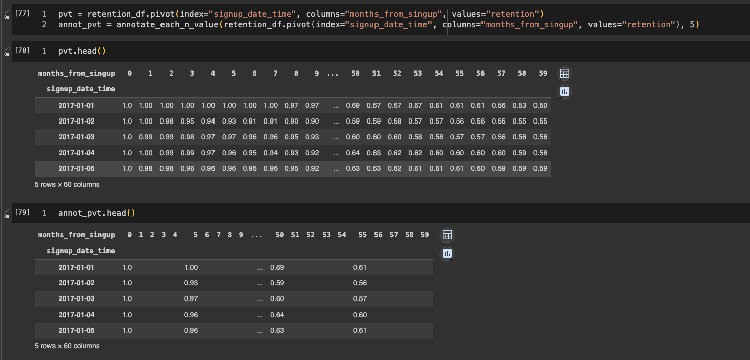
Pivoted and Annotations look:
Heatmap requires this type of table formatting for proper visualizing. It is pretty easy to do with DataFrame.pivot() method.
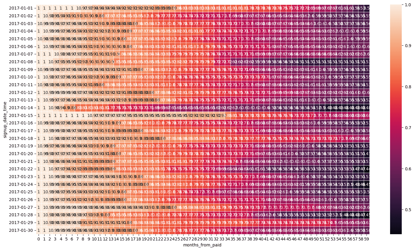
Okay, here is the default Heatmap chart:
You may say that if we remove value lables, then it will look better - definitely will.
However, without proper labelling it looks too tough to find insights, especially for a people that cannot process colors normally.
And, upgraded one:
What I've changed:
Moved X-axis to the top level
Changed color pallete
Added Title
Made rendering of every 5th columns value label
Removed lines between rows and cols
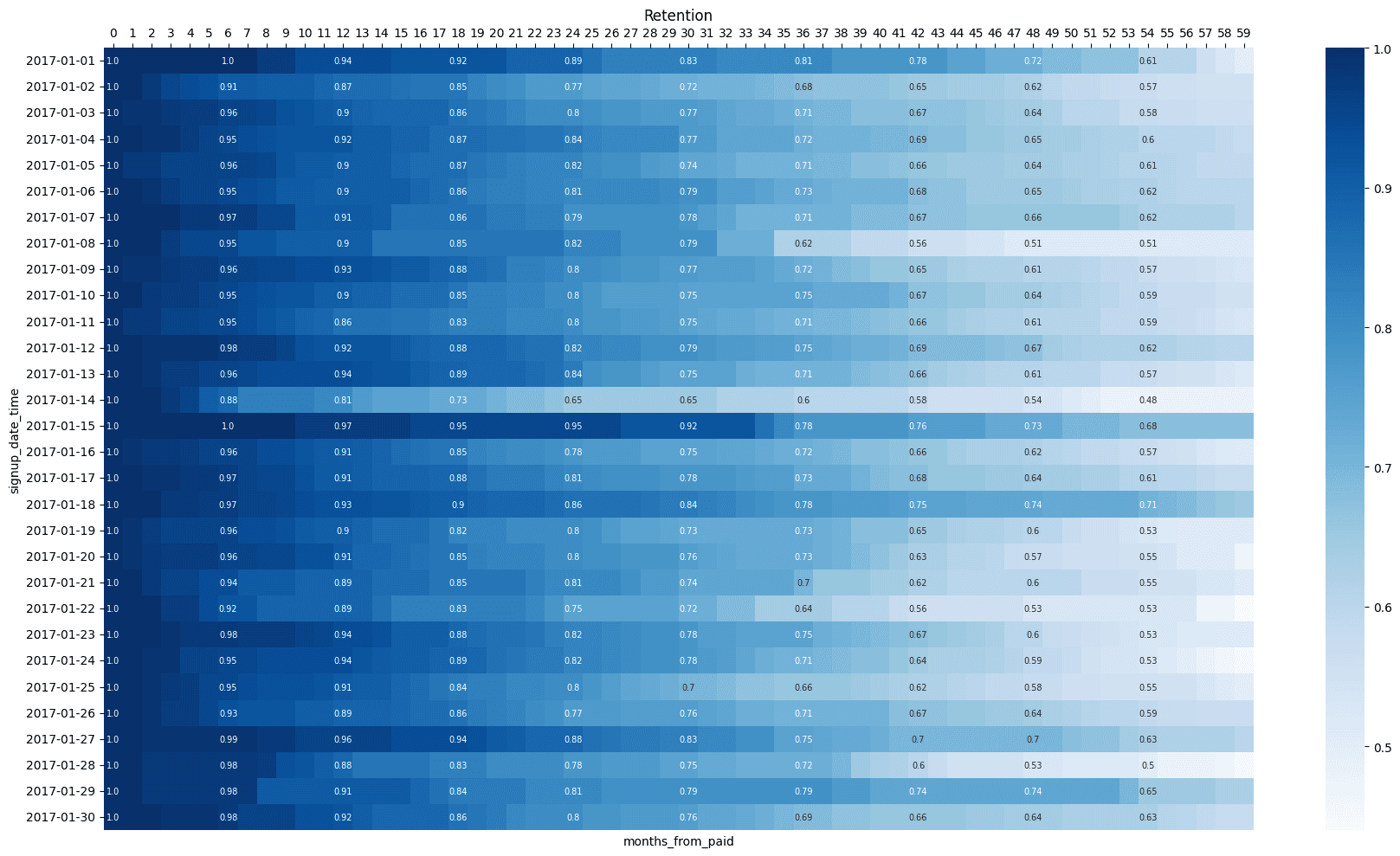
I've used a separate DataFrame with values for annotation to show values only for each of the 5 columns.
Code for Upgraded one:
Code for creating separate annotation DataFrame to show only N-th value lables:
That's all, folks.
